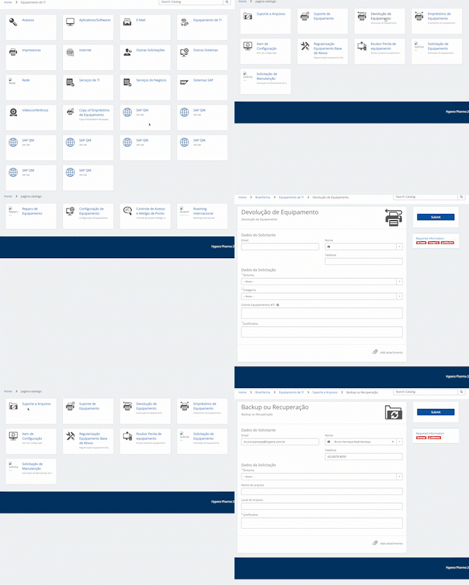
A couple of years ago, I faced an interesting challenge as a ServiceNow developer, a role I’ve been proud to hold since 2015. A client approached me with a unique request – they desired a new method for navigating their Service Catalog, one that echoed the user-friendly layout of Netflix.
As a developer, my standard practice is to encourage clients to utilize ServiceNow’s default widgets, modifying them only from a visual perspective. However, this time, I found myself in agreement with the client’s proposition. It struck me that introducing a fresh, potentially superior way to traverse the Service Catalog could indeed be beneficial.
Fast-forward to today, one can notice that the navigation style of the Employee Center mirrors the concept we had discussed. However, back then, ServiceNow had no similar model in place. Here’s what we achieved:

In this era of constant digital transformation, it’s paramount to adapt and innovate, while still maintaining the core functionality and purpose of our tools. And as a seasoned ServiceNow developer, I’ll continue to strive for such enhancements, leveraging my extensive experience to craft solutions that cater to the evolving needs of businesses.


You must belogged in to post a comment.